Spot Price Comparison
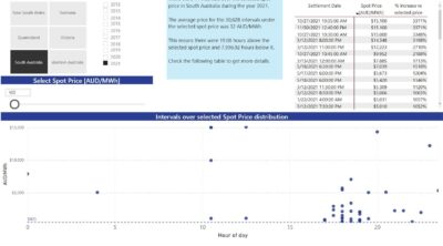
This tool enables the user to select a spot price (from the slicer) and compare it against the spot prices of the selected state and …
This tool enables the user to select a spot price (from the slicer) and compare it against the spot prices of the selected state and …
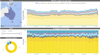
This tool breaks down the energy supply in the NEM for the different states and periods. Note: On a mobile device, the charts are best …
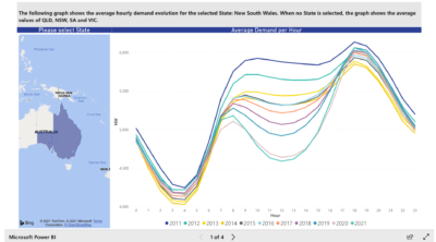
These charts illustrate the average demand for electricity at any given time of day for the last decade.
Navigate through them to understand the impact of solar energy on demand. …
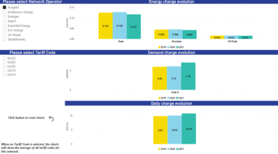
This dynamic tool shows the different rates for each Tariff Code within each network, from 2021 to 2025.
Try it to see how charges stack up for the different operators and codes. …
 Be the first to know |

